colophon
How this site is made: the research it draws on, how each finding was applied, and the alternatives that were explored on the way.
This site was designed based on a chain of insights, with each change grounded in published research on reading, comprehension, and media display, or, where controlled studies do not exist, in standards used by scientific publishing.
Each decision was made by rendering competing systems as working prototypes and comparing them on real content. A selection of the alternatives explored is shown throughout this page.
Legibility research places the comfortable line length for continuous reading at roughly 45 to 85 characters, with about 66 characters as the often-cited ideal.[1] Body text is therefore set in a 520px text block of about 64 characters per line, held inside a wider 715px column that is reserved for media.
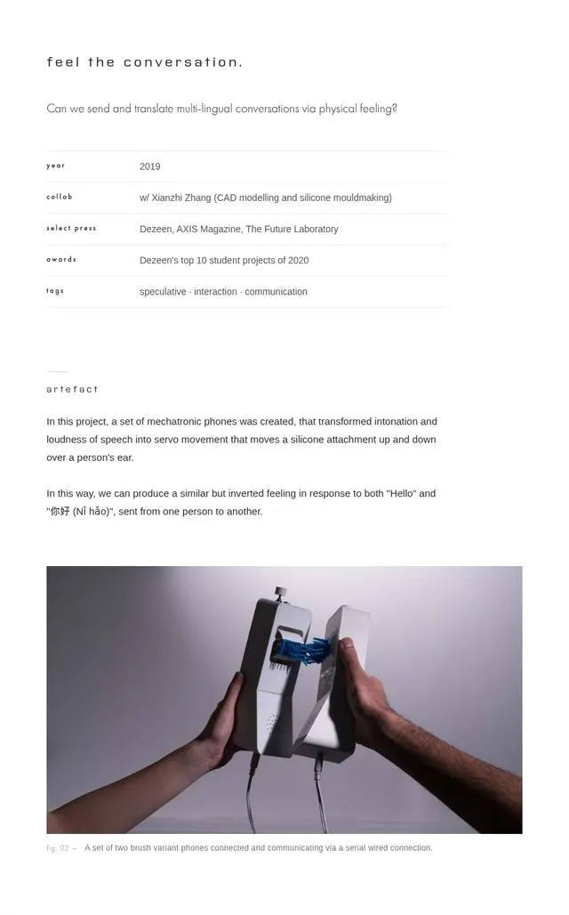
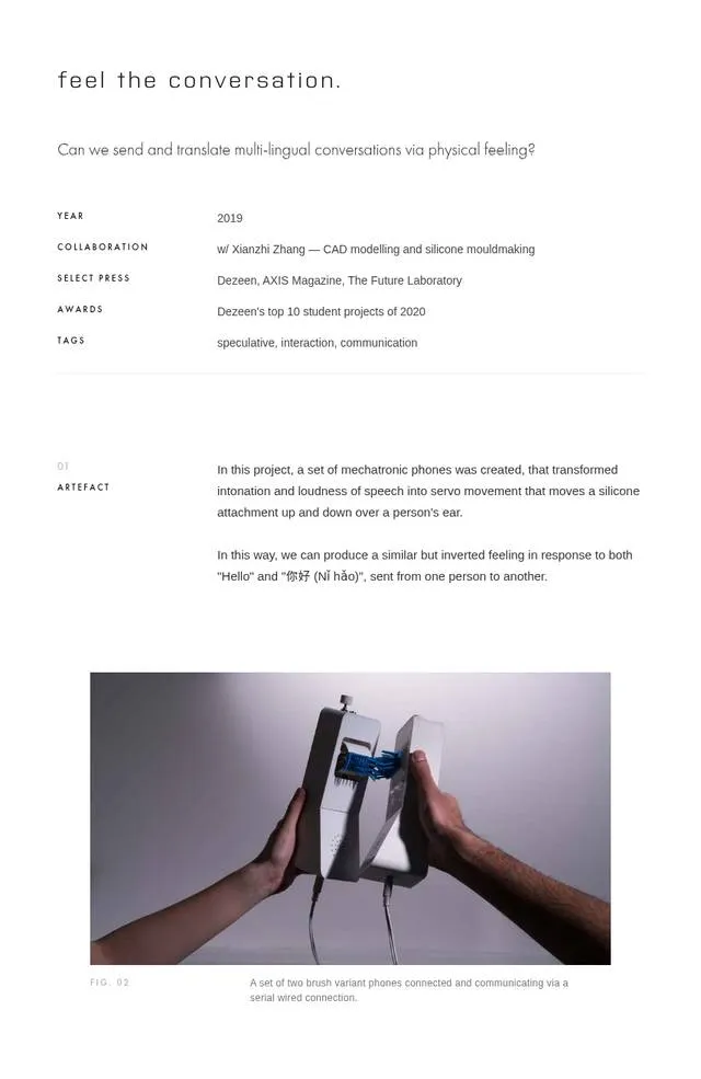
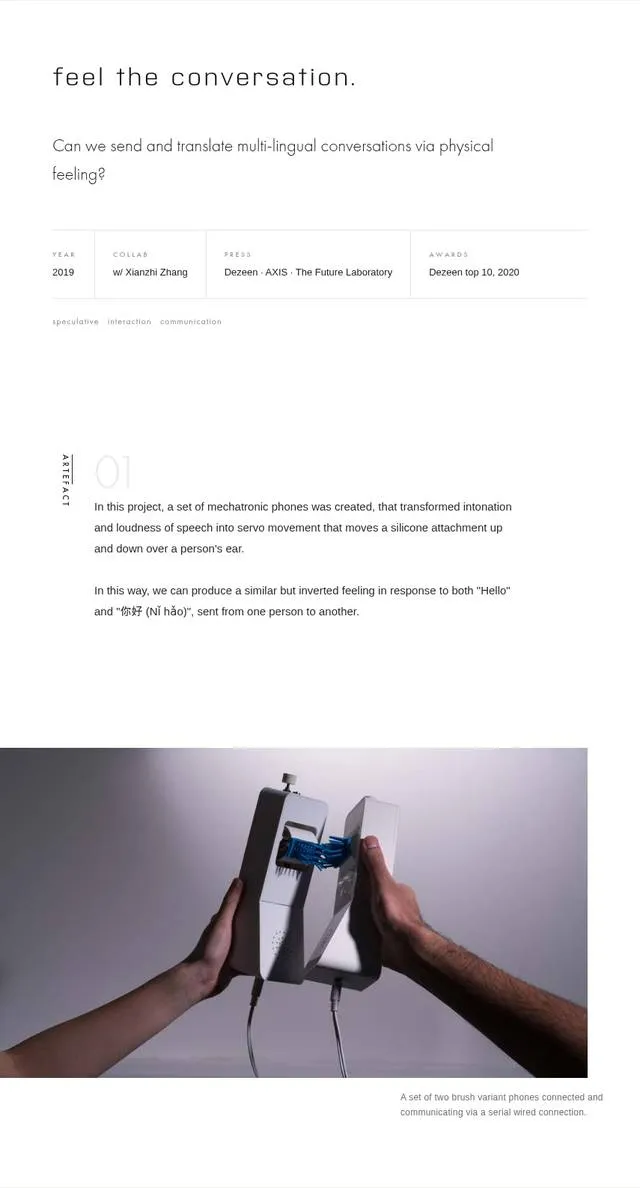
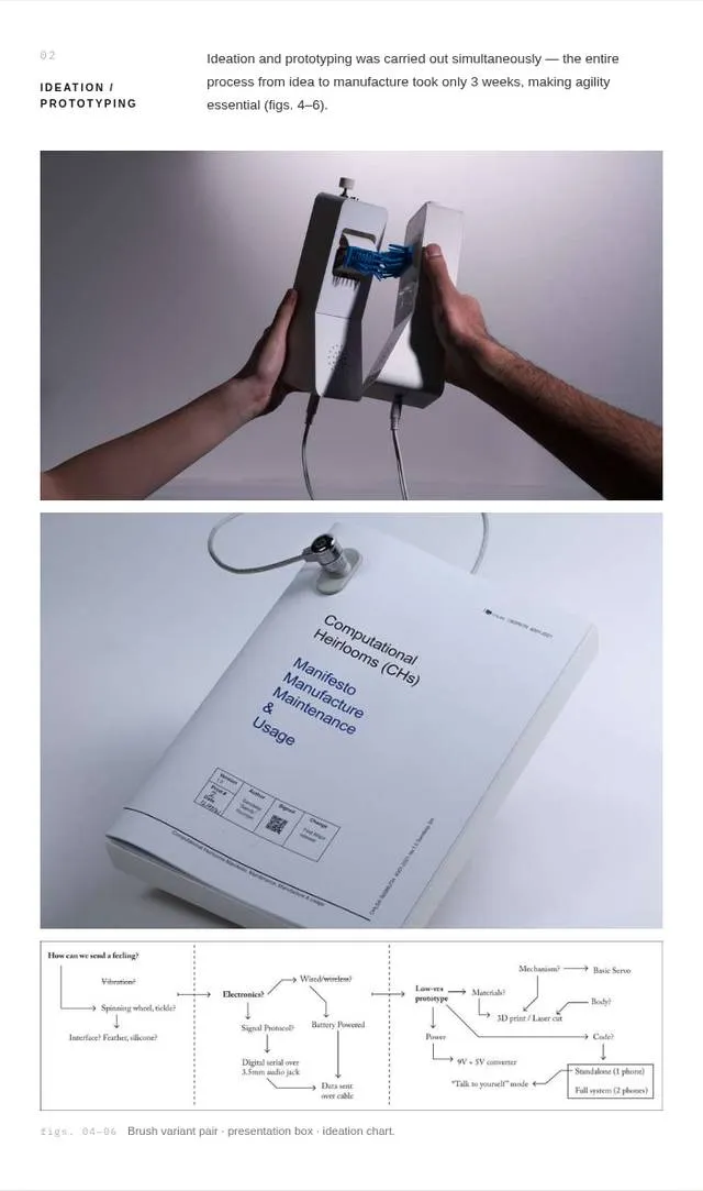
I referenced a meta-analysis of 88 experimental comparisons showing that content presented in meaningful chunks is retained and transferred better than a continuous stream, with lower cognitive load.[2] Project pages are therefore divided into numbered sections, and vertical space follows a two-tier system: 72px between elements within a section, 216px between sections. The segmentation is visible in the spacing itself, without rules or boxes. It is my personal decision to prioritise scannability with ease of navigation for a user to focus on sections they feel are signposted to be of interest to them.
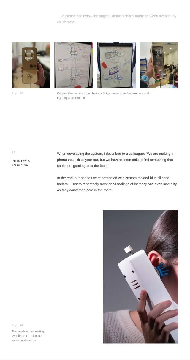
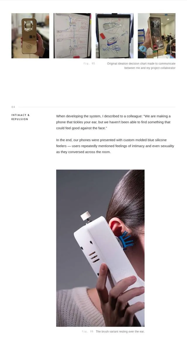
The spatial-contiguity effect, that people understand material better when related words and pictures are physically close, is the best-replicated finding in multimedia-learning research. Richard Mayer's synthesis of the research reports it among the largest effects in the field,[3] and an independent review by Schroeder and Cenkci reached the same conclusion.[4] Captions therefore sit directly beneath their figure, bound at 13px, in one consistent style. Figures are lettered in page order, keeping them distinct from the numeric section marks, following the signalling principle[3] and standard journal practice, where every figure must be referenced from the text.[5]
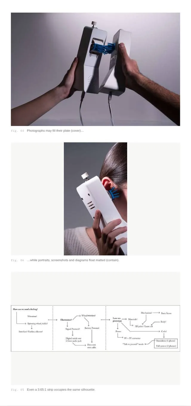
No controlled study I could find directly compares strategies for displaying mixed-ratio media, so this site adopts the standards of scientific publishing. Nature permits figures at exactly two widths and Science at three, never arbitrary sizes.[6][7] Here media take one of two widths. Photographs and wide strips run the full 715px column, while informational media (diagrams, screenshots, interfaces) sit at the 520px text width, in line with the prose they support.
Eye-tracking shows readers scrutinise information-carrying images and skip decorative ones,[8] so informational media are never cropped and aspect ratios are always preserved. Unusually tall media are height-capped and displayed contained on a neutral ground, the equivalent of a journal's figure-height limit, which exists so a figure and its caption share one view.[6]
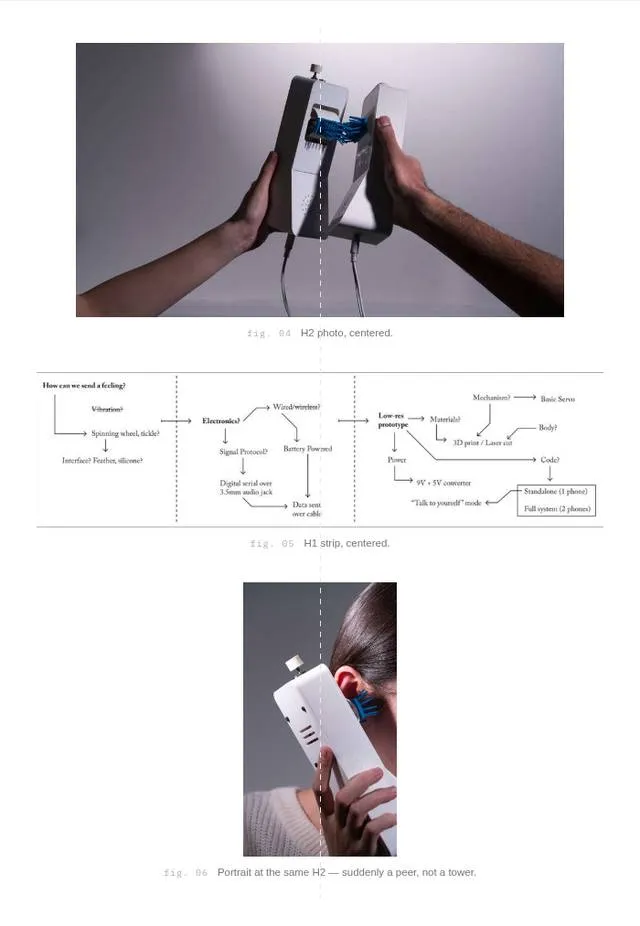
Eye-tracking of alternating image and text layouts shows that unpredictable placement makes scanning measurably less efficient. Readers fixate where they expect content and find none.[9] Every figure, caption, and paragraph on this site therefore shares one flush left axis. An earlier version of this design alternated tall images left and right. I retired it on this evidence.
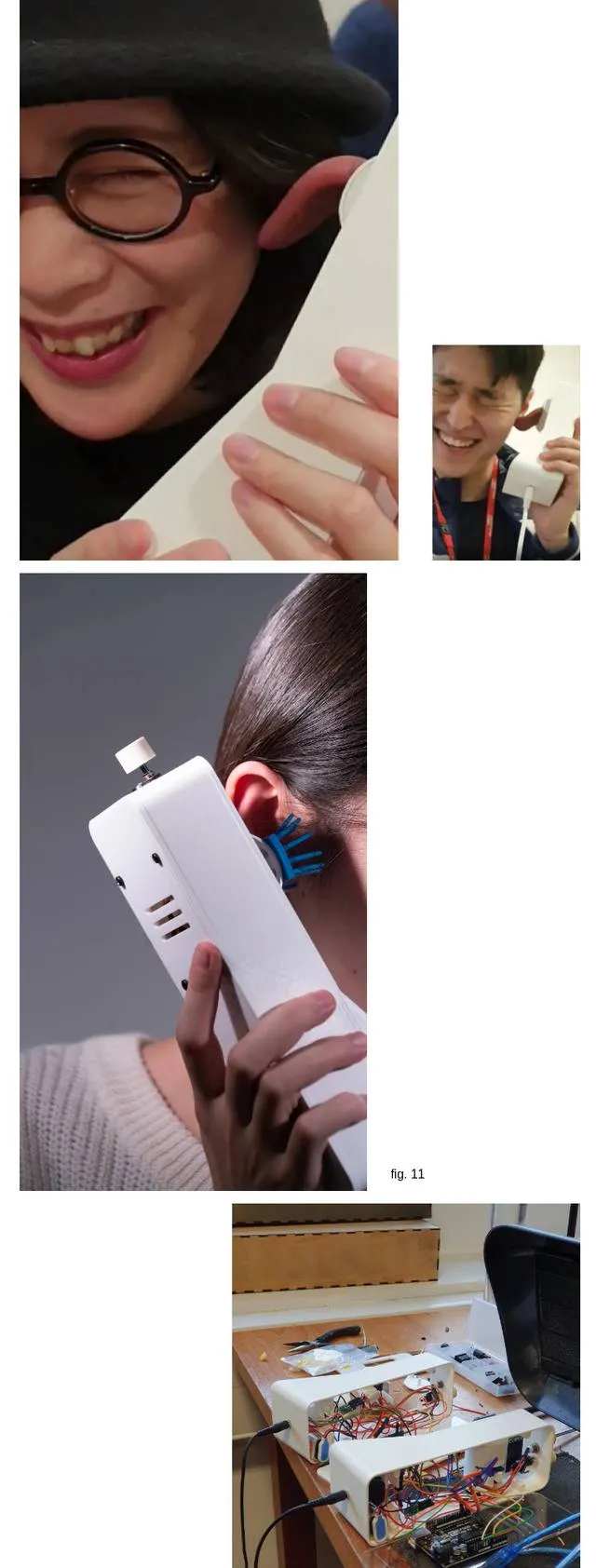
Layout shift makes readers lose their place, and it is one of the few display qualities with an industry-standard measurable threshold: a cumulative layout shift of at most 0.1.[10] Every image's dimensions are computed at build time and declared in the markup, so each silhouette is reserved before the file loads and the page never reflows.
Videos and embedded builds play in place immediately, muted, with controls available. This is to increase passive scannability, treating media as content in the flow of the page. Video sizes are optimised to keep this lightweight.
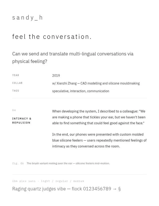
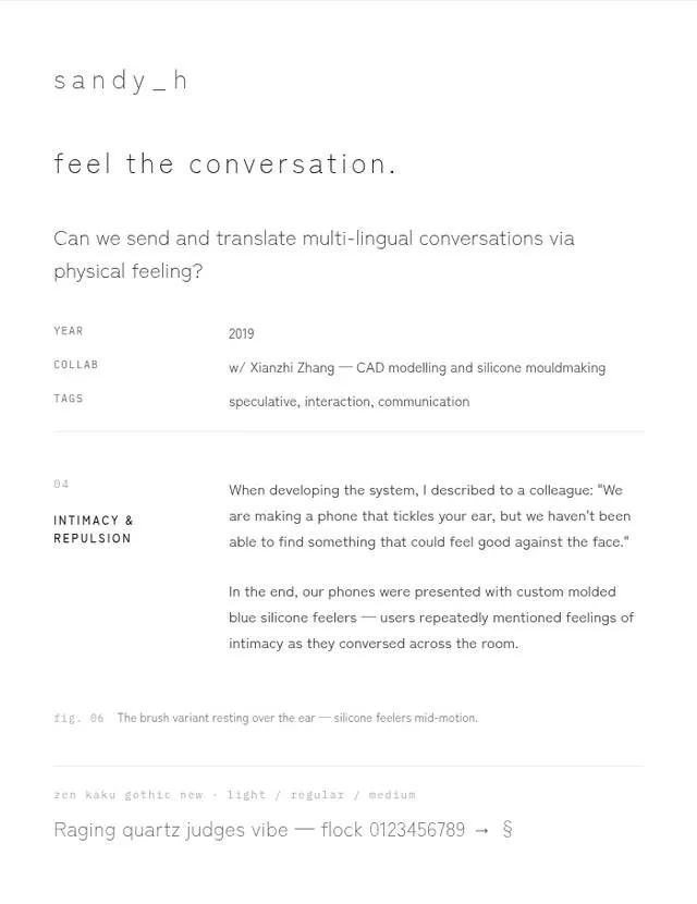
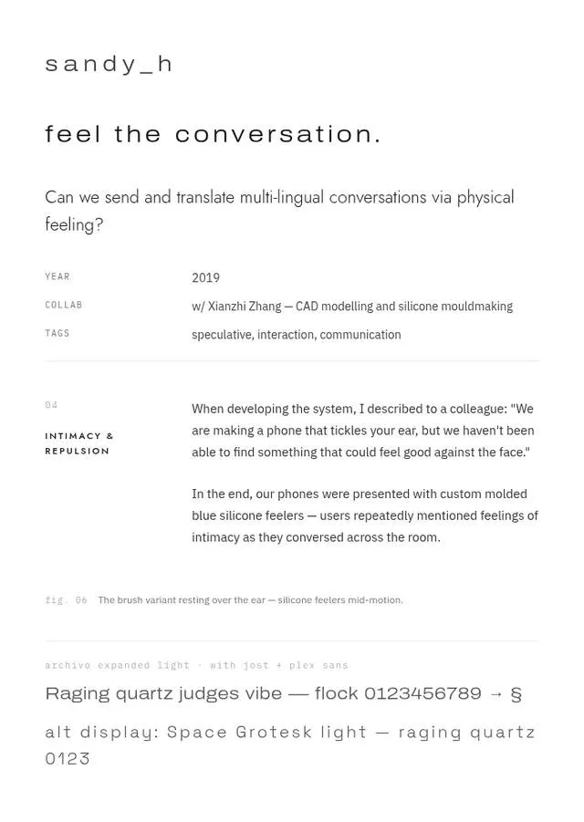
Two typefaces with strict roles. Zen Kaku Gothic New (SIL Open Font License) is the reading voice, Light for the identity and titles, Medium for labels, Regular for text. IBM Plex Mono (OFL) is the instrument voice, and only ever speaks in labels and numbers, including section numerals, figure marks, metadata, tags. Confining the second typeface to a single narrow role keeps hierarchy legible without decorative variety. All fonts are open-licence and self-hosted, so the site renders identically on every operating system.
It is my personal belief that being reminded of nature is critical to effective design and engineering work. A small amount of wildlife is injected into this site in the form of a simulated butterfly.
The flight is modelled on Chen et al.'s parametric model of butterfly flight for real-time animation,[11] taking its split of flight into separate maneuvering phases and its asymmetric wingbeat, then modified to fit a character matching my impression of a butterfly from memory. An existing browser butterfly was a useful reference.[12] It animates in CSS, while this one runs in JavaScript instead, because the wing shapes are recalculated every frame.
It beats at 11 Hz, drifting by up to 3 Hz. The stroke runs from 6 degrees past flat to 120 degrees folded, spending 42 per cent of each cycle going down and the rest recovering. The two wings run on slightly different clocks, so they drift in and out of sync. It flies every 22 to 60 seconds, hesitates before taking off, circles before landing, and a nearby cursor startles it. Long trips are flown in 575px hops with a pause midair.
The drawing is two triangles sharing one edge. That edge is the hinge. Each wing folds about it in three dimensions, so the tips follow a real arc. They are filled white so the butterfly covers whatever it passes over, and outlined in a 0.45px line.
A fully static site built with Astro. I believe any website should be accessible to people with slow connections and respect other people's time, so the only client JavaScript is the image lightbox, the small-screen menu, and the butterfly, together a few kilobytes. Multi-image galleries are computed at build time as balanced columns that preserve every aspect ratio, so no gallery library ships to the browser.
- [1] Baymard Institute. Readability: the optimal line length. baymard.com/blog/line-length-readability
- [2] Rey, G. D. et al. (2019). A meta-analysis of the segmenting effect. Educational Psychology Review. link.springer.com/article/10.1007/s10648-018-9456-4
- [3] Mayer, R. E. & Fiorella, L. Principles for reducing extraneous processing in multimedia learning. Cambridge Handbook of Multimedia Learning. cambridge.org/core/books/abs/cambridge-handbook-of-multimedi
- [4] Schroeder, N. L. & Cenkci, A. T. (2018). Spatial contiguity and spatial split-attention: a meta-analysis. Educational Psychology Review. link.springer.com/article/10.1007/s10648-018-9435-9
- [5] PLOS ONE. Figure preparation requirements. journals.plos.org/plosone/s/figures
- [6] Nature. Final artwork guidelines. nature.com/documents/nature-final-artwork.pdf
- [7] Science/AAAS. Instructions for preparing figures. science.org/content/page/instructions-preparing-initial-manu
- [8] Nielsen Norman Group. Photos as web content. nngroup.com/articles/photos-as-web-content/
- [9] Nielsen Norman Group. Zigzag image–text layouts make scanning less efficient. nngroup.com/articles/zigzag-page-layout/
- [10] Google Web Vitals. Cumulative layout shift. web.dev/articles/cls
- [11] Chen, Q., Lu, T., Tong, Y., Luo, G., Jin, X. & Deng, Z. (2022). A practical model for realistic butterfly flight simulation. ACM Transactions on Graphics 41(3), 1–12. dl.acm.org/doi/10.1145/3510459
- [12] teochewthunder. browserbutterfly: animated butterfly in HTML, CSS and JavaScript. github.com/teochewthunder/browserbutterfly